27 Kitchen Color Ideas That Make Your Space Look Modern, Warm & Expensive
A kitchen does not need a complete renovation to feel completely different. Sometimes, changing the color of your cabinets, walls, island, backsplash, or even a few smaller accents can transform the entire room.
The right kitchen color can make a small space feel larger, give a dark kitchen more warmth, or make an ordinary layout look more sophisticated. The key is not simply choosing a beautiful color—it is choosing a color combination that works with your lighting, countertops, flooring, hardware, and overall home style.
From calming sage green and timeless warm white to dramatic charcoal, chocolate brown, and deep plum, these 27 kitchen color ideas offer practical combinations for modern, cozy, elegant, and character-filled kitchens.
1. Warm White Kitchen with Natural Wood
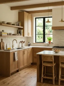
Warm white is one of the easiest colors to work with when you want a kitchen that feels bright without looking cold. Unlike stark white, a warmer shade has subtle cream or beige undertones that create a softer atmosphere.
Pair warm white cabinets with natural oak, walnut, or ash wood to introduce texture and visual warmth. A light stone countertop and simple ceramic backsplash can keep the design clean.
Brushed brass hardware works beautifully here, while black hardware creates a sharper contemporary contrast. This combination is particularly effective in open-plan kitchens because it feels timeless and blends easily with adjoining living spaces.
2. Sage Green Cabinets with Cream and Brass
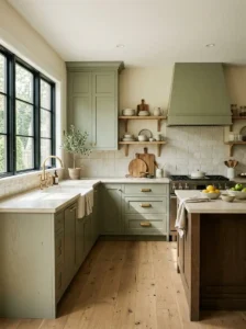
Sage green remains a beautiful choice for homeowners who want color without making the kitchen overwhelming. Its muted, earthy appearance works especially well with warm neutrals.
Use sage on the cabinets and combine it with creamy walls, a light quartz countertop, and brushed brass handles. Natural wood accessories can add another layer of warmth.
For a softer appearance, choose a matte cabinet finish. If the kitchen receives plenty of daylight, sage green can look especially fresh and natural.
3. Moody Navy Blue with Warm Brass
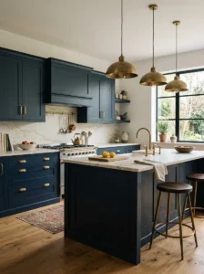
Navy blue gives kitchen cabinetry a sophisticated and slightly dramatic appearance without being as intense as black.
Use navy on lower cabinets or a large island while keeping the upper cabinets and walls lighter. White or warm marble-look countertops can provide enough contrast to prevent the room from feeling too dark.
Add brass handles and pendant lights for a polished finish. In kitchens with limited natural light, use warm layered lighting to keep navy cabinetry from appearing almost black.
4. Greige Cabinets with Natural Stone and Wood
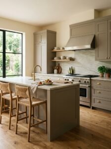
Greige—a combination of gray and beige—is an excellent option when you want a neutral kitchen with more depth than plain white.
Greige cabinets work beautifully with natural stone countertops, light wood flooring, and warm white walls. The color can shift slightly depending on the lighting, making the kitchen feel dynamic throughout the day.
Choose warmer greige tones for kitchens with north-facing windows and slightly cooler versions when the room receives strong warm sunlight.
5. Terracotta with Warm Earthy Accents
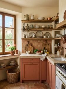
Terracotta introduces an earthy, Mediterranean-inspired character into the kitchen. It is especially effective when used as an accent rather than covering every surface.
Try terracotta on a backsplash, island base, lower cabinets, or a feature wall. Balance it with cream, sand, beige, or warm white.
Natural clay accessories, wooden cutting boards, woven textures, and aged brass hardware can reinforce the earthy palette. This combination is ideal for creating a kitchen that feels warm and welcoming rather than overly formal.
6. Olive Green with Light Oak
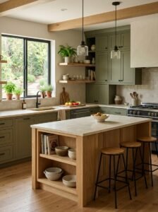
Olive green brings an organic quality to kitchen interiors and pairs exceptionally well with natural wood.
Use olive cabinetry with light oak shelves, flooring, or an island. Keep countertops relatively light so the darker green does not dominate the room.
Black or aged-brass hardware can add definition, while warm-white lighting brings out the yellow undertones in olive. This palette works particularly well in kitchens inspired by nature and organic modern interiors.
7. Charcoal Gray with Warm White Countertops
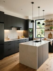
Charcoal gray offers the visual impact of a dark kitchen while remaining more versatile than pure black.
Use charcoal cabinets with warm white countertops and a soft neutral backsplash. This creates a strong contrast without making every element compete for attention.
Wooden stools, open shelving, or a natural wood island can soften the darker cabinetry. Because charcoal absorbs light, good overhead and under-cabinet lighting is especially important.
8. Dusty Blue with Soft White Walls
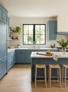
Dusty blue creates a calm and airy kitchen without feeling overly colorful. Its muted quality makes it easier to live with than brighter blue shades.
Use dusty blue on cabinets and pair it with soft white walls, light countertops, and pale wood flooring.
Brushed nickel or brass hardware can both work, depending on the mood you want. Brass makes the palette warmer, while brushed nickel creates a cooler contemporary appearance.
9. Cream Cabinets with Walnut Wood
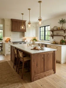
Cream and walnut create a sophisticated combination that feels both traditional and contemporary.
Choose creamy cabinetry for the main storage areas and introduce walnut through an island, shelves, flooring, or furniture. The deep grain of walnut adds richness against the softer cream background.
Keep the backsplash simple so the wood remains a visual feature. Warm lighting will emphasize the natural variation in the walnut and make the kitchen feel especially inviting in the evening.
10. Forest Green with Marble Countertops
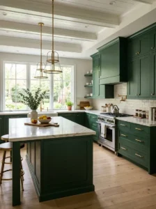
For a dramatic but natural kitchen, combine deep forest green cabinetry with a pale marble or marble-look surface.
The strong green creates depth while the light countertop reflects light back into the room. White, cream, or softly veined stone can provide an elegant contrast.
Use simple hardware so the cabinetry remains the main feature. This color combination works especially well in kitchens with large windows or plenty of layered lighting.
11. Taupe with Matte Black Hardware
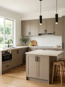
Taupe is a versatile neutral that sits comfortably between beige and gray. It gives a kitchen more character than basic white while remaining easy to coordinate.
Pair taupe cabinets with matte black handles, faucets, and light fixtures. A light stone countertop can brighten the overall palette.
For a softer look, add natural oak flooring or wooden accessories. The result is structured and modern without feeling excessively industrial.
12. Muted Teal with Warm Wood
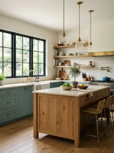
Muted teal provides more personality than standard blue or green while still maintaining a sophisticated appearance.
Use it primarily on cabinetry and balance it with warm oak, walnut, or bamboo elements. Keep surrounding walls neutral to prevent the color from becoming visually heavy.
Creamy countertops and warm lighting help bring out teal’s softer undertones. This is a great option for homeowners who want a colorful kitchen that still feels refined.
13. Soft Beige with Black Fixtures
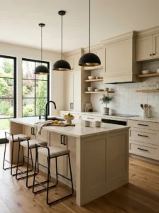
Soft beige creates a warm foundation that can make both modern and traditional kitchens feel comfortable.
Pair beige cabinets or walls with black faucets, handles, pendant lights, and slim framing details. The black creates definition against the softer background.
Add natural stone and wood textures rather than introducing too many additional colors. This helps the kitchen feel cohesive and expensive without requiring elaborate decoration.
14. Chocolate Brown with Warm Neutrals
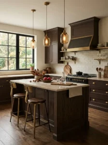
Chocolate brown is an excellent choice for creating a richer, moodier kitchen. It works particularly well when balanced with lighter materials.
Use deep brown on cabinetry or an island and pair it with warm white walls, cream countertops, or beige stone.
Natural wood tones can either complement or slightly break up the brown palette. Gold or aged-brass hardware adds subtle elegance without making the kitchen feel overly formal.
15. Pale Blue and White
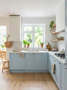
Pale blue and white can make a kitchen feel open, clean, and refreshing.
Use pale blue cabinets with white walls and countertops. A subtle textured backsplash can provide interest without introducing another strong color.
This combination is particularly effective in smaller kitchens because the lighter palette reflects natural light. Add pale wood or woven accessories if you want the room to feel less sterile.
16. Warm Gray with Natural Oak and Brass
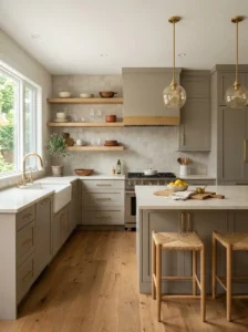
Warm gray is a more welcoming alternative to cool gray. It works beautifully with natural wood because both have understated, earthy qualities.
Choose warm-gray cabinetry with oak flooring, shelves, or an island. Brass hardware can add a small amount of contrast and shine.
For countertops, choose creamy white or warm stone instead of an icy white. This keeps the entire palette connected.
17. Black Cabinets with Light Wood
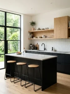
Black and light wood create one of the strongest modern kitchen contrasts.
Use matte black on lower cabinets or the island and introduce light oak on shelves, upper cabinets, or furniture. The wood prevents black from making the room feel too severe.
Light countertops and good natural lighting can further balance the composition. Keep the hardware simple so the contrast between black and wood remains the star of the room.
18. Soft Peach with Cream and Natural Stone
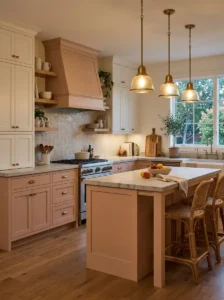
Soft peach can make a kitchen feel warm and distinctive without becoming overly bright.
Choose a muted peach rather than a saturated orange-pink. It works particularly well on walls, an island, or selected cabinetry.
Pair it with cream cabinets, pale stone, and natural wood. Warm white lighting enhances the color and creates a cozy atmosphere during the evening.
19. Plum and Cream for Sophisticated Contrast
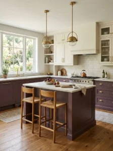
Deep plum adds richness and personality to a kitchen. Because it is such a strong color, it works best when balanced with lighter neutrals.
Try plum on lower cabinets or the kitchen island and use cream for upper cabinets or walls.
Brushed brass hardware can make the combination feel elegant, while simple black fixtures create a more contemporary look. Keep the surrounding materials understated so the plum does not compete with busy patterns.
20. Mustard Yellow with Dark Wood
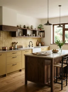
Mustard yellow is a bold choice that can instantly make a kitchen feel more energetic.
Instead of using it everywhere, consider mustard lower cabinets, a small accent wall, bar stools, or a backsplash.
Deep walnut or espresso-toned wood gives the yellow a grounded appearance. Keep countertops and walls neutral so the color remains intentional rather than overwhelming.
21. Mushroom Brown with Creamy White
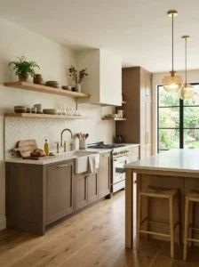
Mushroom brown is a soft, earthy neutral that works beautifully in kitchens where you want warmth without obvious color.
Pair mushroom-colored cabinets with creamy white countertops and a slightly lighter backsplash. Natural wood can be added through flooring or open shelves.
This palette works particularly well in transitional and organic-modern kitchens because it feels current without relying on a short-lived trend.
22. Lavender with Light Gray
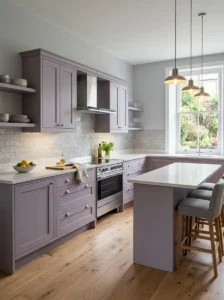
Lavender can give a kitchen an unexpected personality when used in a muted, sophisticated shade.
Choose a dusty or gray-based lavender rather than a bright purple. Use it on cabinetry or a feature wall and pair it with light gray, white stone, and simple hardware.
Natural daylight can make the color feel fresh, while warm evening lighting gives it a softer appearance.
23. Off-White with Natural Green Accents
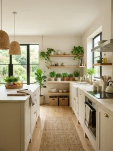
Off-white is an excellent foundation for homeowners who want maximum flexibility.
Instead of adding another dominant cabinet color, bring green into the kitchen through plants, herbs, artwork, seating, or small accessories.
Natural wood, stone, and woven materials can make the neutral palette more interesting. This approach is also easy to update because the accent colors can be changed without repainting the entire kitchen.
24. Two-Tone Kitchen Cabinets
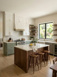
Two-tone cabinetry allows you to combine contrasting colors without committing the entire kitchen to one shade.
Some combinations that work particularly well include:
- Warm white upper cabinets with sage green lowers
- Cream uppers with navy lowers
- White cabinets with a walnut island
- Greige uppers with charcoal lowers
- Cream cabinets with forest-green island cabinetry
Generally, keep one color lighter and use the stronger shade as the visual anchor. This prevents the kitchen from looking visually crowded.
25. Small Kitchen Colors That Make the Space Feel Bigger
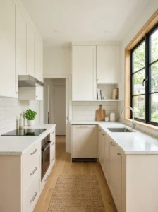
Small kitchens benefit from colors that reflect light and create visual continuity.
Warm white, cream, pale blue, soft sage, light greige, and pale beige are excellent choices. Using similar colors on cabinets and walls can make boundaries less noticeable and help the room feel larger.
Glossy or satin surfaces can increase reflected light, but matte finishes can still work beautifully when the kitchen has strong natural or artificial lighting.
For a small kitchen, avoid using too many competing dark colors. Instead, introduce contrast through hardware, wood accents, or a small island.
26. Kitchen Colors for Dark Spaces
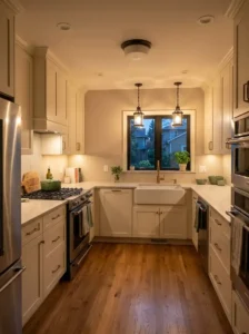
A kitchen with limited natural light needs a slightly different color strategy.
Warm whites, creamy beige, pale taupe, soft sage, muted blue, and light greige can help maintain brightness without making the room feel sterile.
Warm artificial lighting is equally important. Under-cabinet lights, pendant fixtures, ceiling lighting, and strategically positioned task lighting can make darker kitchens feel significantly more comfortable.
If you love dark colors, use them selectively on an island or lower cabinets instead of covering every surface.
27. Kitchen Color Trends for 2026
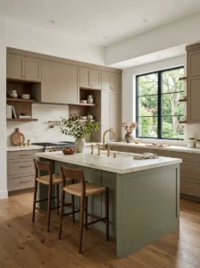
Kitchen design in 2026 is moving beyond the idea that every kitchen needs to be completely white, gray, or ultra-minimal.
Earth-inspired greens, warm neutrals, natural wood, richer browns, muted blues, and sophisticated two-tone combinations offer more personality while remaining practical.
Instead of following a single trend, consider choosing a color palette that works with the architecture and lighting of your home. A timeless neutral foundation can also be combined with a trend-forward accent color, allowing you to update the look later without a major renovation.
How to Choose the Right Kitchen Color
Before choosing a paint color or cabinet finish, look at the kitchen as a complete space rather than considering each surface separately.
Consider Natural Light
A color can look dramatically different depending on the direction and amount of sunlight entering the room. Test samples at different times of the day before making a final decision.
Match the Countertop
Your countertop is often one of the largest visual surfaces in the kitchen. Check the undertones of the stone before selecting cabinet colors.
Warm countertops generally work better with cream, beige, taupe, olive, and warm wood. Cooler stone can work with blue, charcoal, gray, and crisp white.
Think About Cabinet Size
Dark colors can look beautiful on large kitchens, but using them on every cabinet in a small room may make the space feel enclosed.
If you love a dark shade, try it on an island or lower cabinets.
Coordinate Your Hardware
Hardware can change the personality of a color combination.
- Brass adds warmth and elegance.
- Matte black adds modern contrast.
- Chrome feels crisp and contemporary.
- Brushed nickel works well with cooler palettes.
- Aged brass creates a softer, traditional appearance.
Don’t Ignore the Flooring
The floor should support the color palette rather than compete with it. If your flooring already has strong grain or color variation, simpler cabinets may create a more balanced result.
How to Combine Kitchen Colors Without Making the Room Look Busy
A successful kitchen palette usually has a dominant color, a supporting color, and one or two accent materials.
For example:
Dominant: warm white cabinets
Supporting: natural oak
Accent: brushed brass
Or:
Dominant: sage green cabinets
Supporting: cream walls
Accent: walnut and black hardware
This approach creates hierarchy and prevents every surface from demanding attention.
Should Kitchen Cabinets and Walls Be the Same Color?
They do not have to be.
Using similar shades can make a small kitchen feel larger because the visual boundaries become less obvious. Contrasting cabinets and walls, however, can create stronger architectural definition.
For example, cream walls with sage cabinets create a gentle contrast, while white walls with navy cabinets produce a much stronger statement.
What Kitchen Colors Make a Space Look More Expensive?
Colors alone do not determine whether a kitchen looks expensive. The combination of color, material, lighting, and consistency is what creates a high-end appearance.
Warm neutrals, deep green, navy, chocolate brown, charcoal, cream, and natural wood can all look sophisticated when paired with quality-looking surfaces and restrained hardware.
Avoid using too many unrelated colors. A simple palette with beautiful textures often looks more luxurious than a complicated one.
Final Thoughts
The best kitchen color is not necessarily the boldest or most fashionable shade. It is the one that works with your home’s natural light, existing materials, kitchen size, and personal style.
Warm whites and creams are excellent for timeless spaces, while sage, olive, forest green, navy, and muted teal introduce more personality. Richer shades such as chocolate brown, charcoal, and plum can create a dramatic atmosphere when balanced with lighter surfaces.
If you are unsure about committing to a strong color, start with an island, lower cabinets, backsplash, or small accent area. Once you understand how the color behaves in your kitchen’s natural and artificial lighting, you can confidently build the rest of the palette around it.
A thoughtful color combination can make an ordinary kitchen feel brighter, warmer, more modern, and much more personal—without requiring a complete remodel.